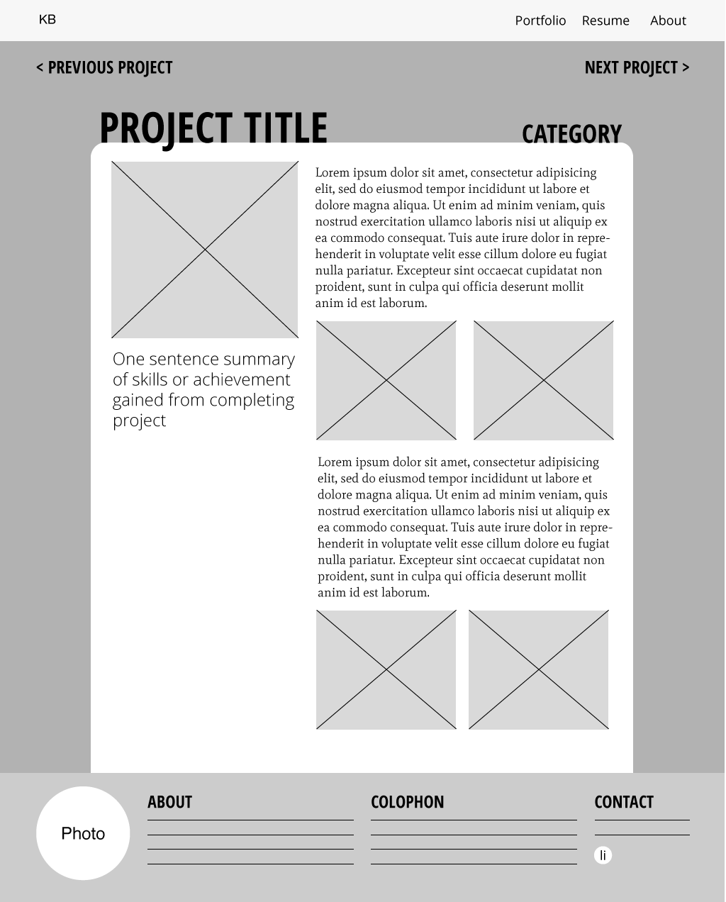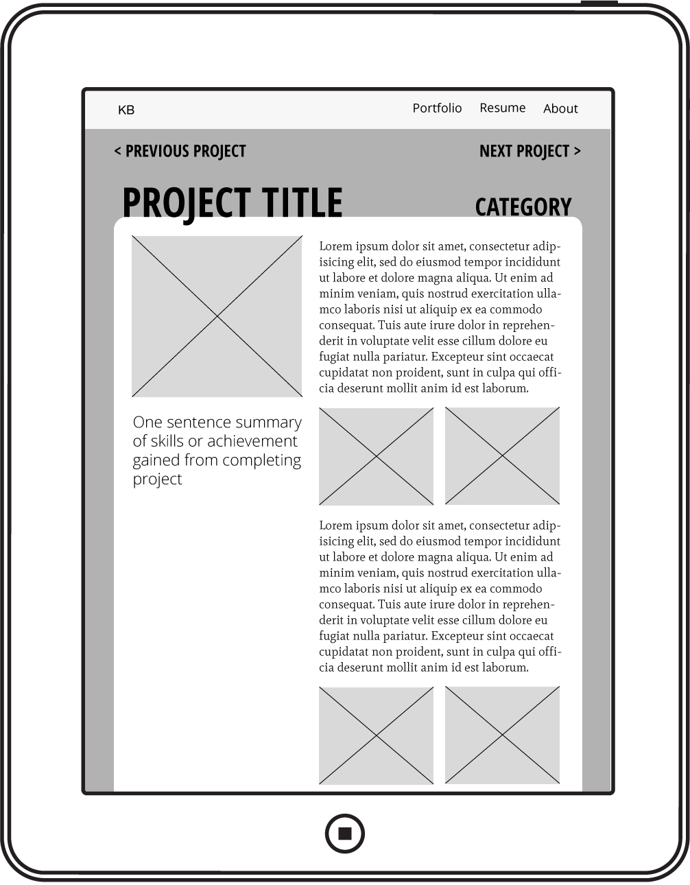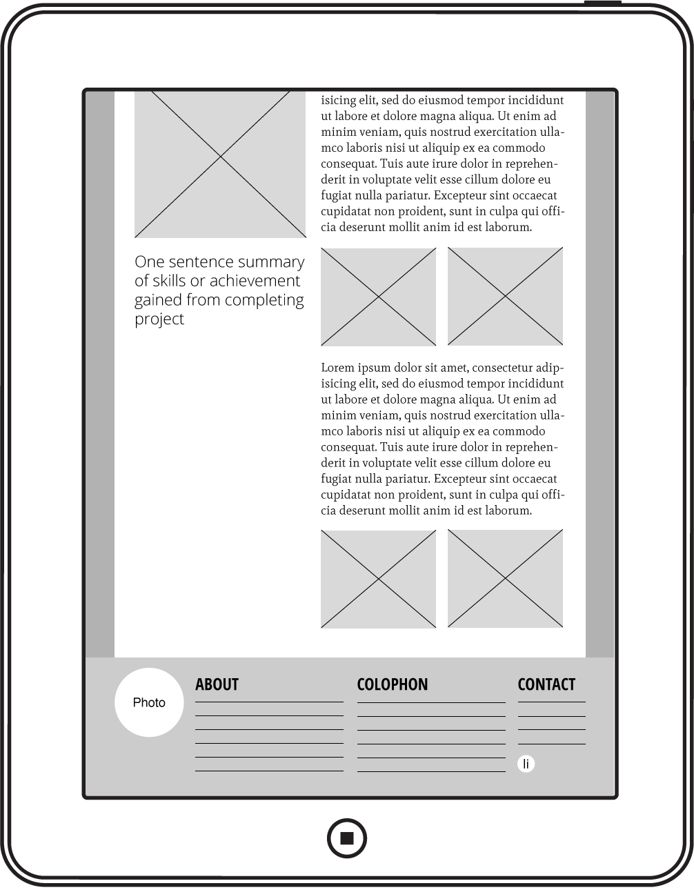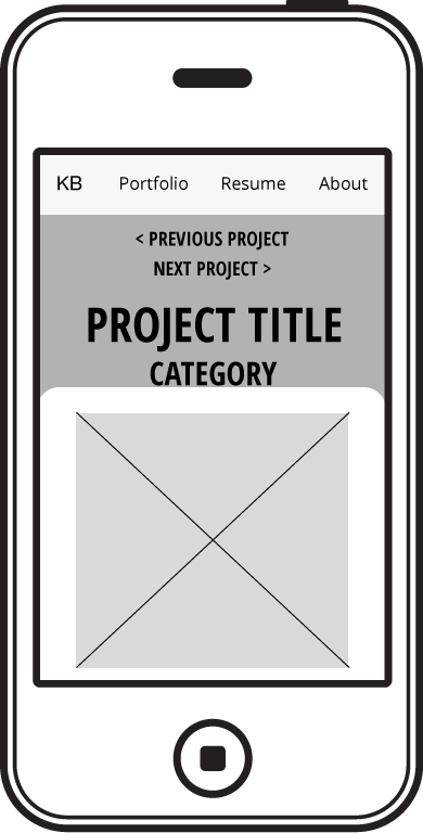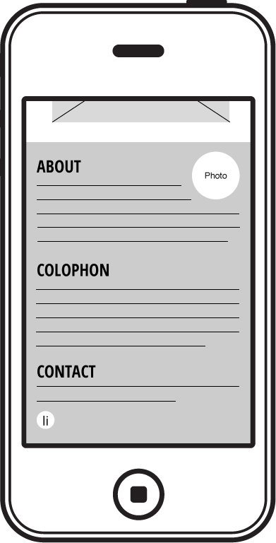
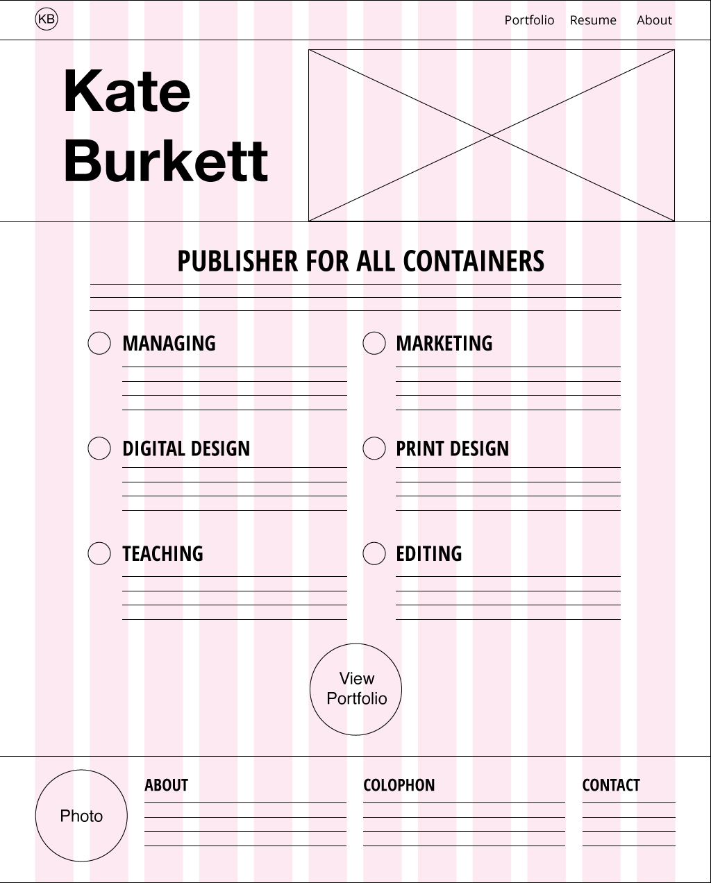
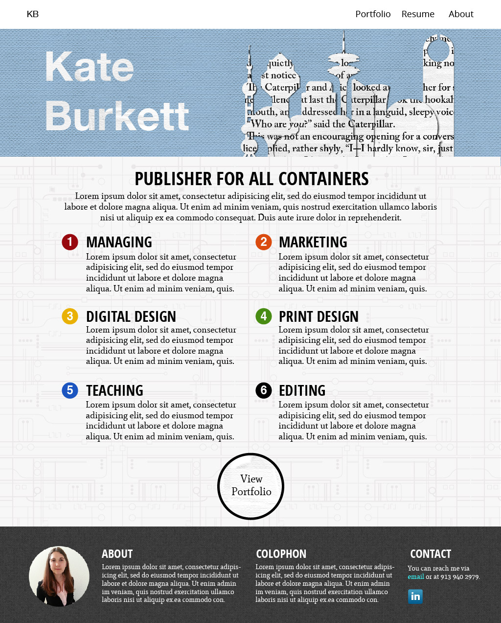
Wireframes, mockups, and other UI documents from the creation of this website
All the design documents on this page are from the first edition of this website, which I then developed using Bootstrap for the responsive grid and WordPress as the Content Management System. I wrote html5, css3, php, and js to create the website's design and theme.
You can click on the thumbnails if you'd like to see these mockups in more detail.
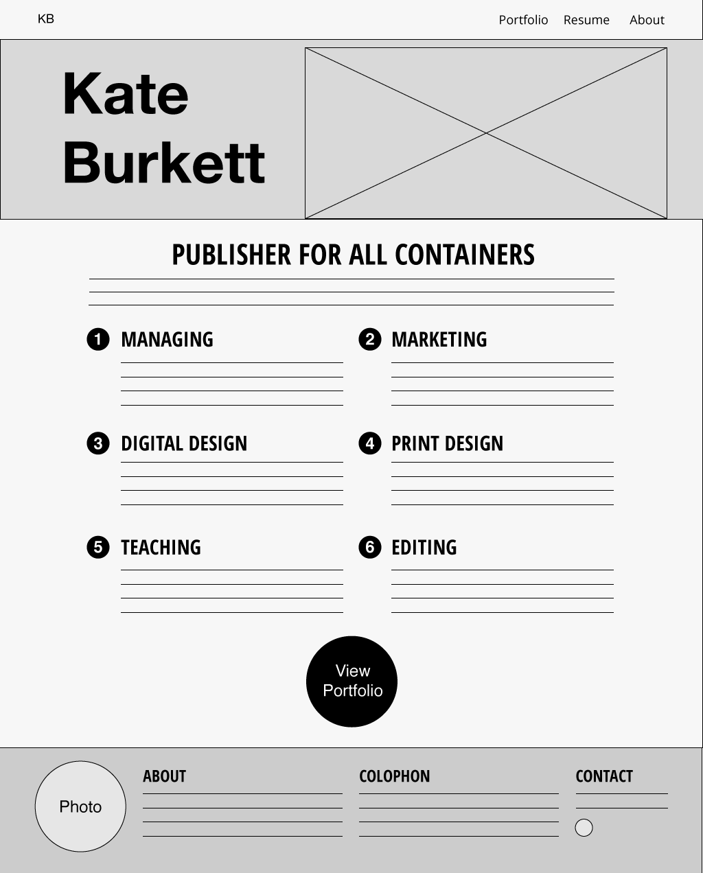
This website was designed with media queries to be responsive to screen width. These wireframes show how the design of a project page changes to optimize for the width of the user's screen.