I optimized the homepage, increased website usability, and created promotional banners as web master of Ooligan Press
For a full list of what I accomplished as Digital Content Manager at Ooligan Press—including the web application I developed that was featured in Publisher’s Weekly—visit the Digital Content and Start to Finish sections of my portfolio.
On this page, I go into more detail about the coding I did as a member of the Digital Content team and the projects I prioritized as web master of the Ooligan Press website. My goal was to keep people on the site once they landed there. I wanted to move them through a flow that gave them more impressions of our products and books, and it worked. By the end of my time as web master, site visits had doubled, and page views were even better—they increased by 56 percent.
Coding the Website
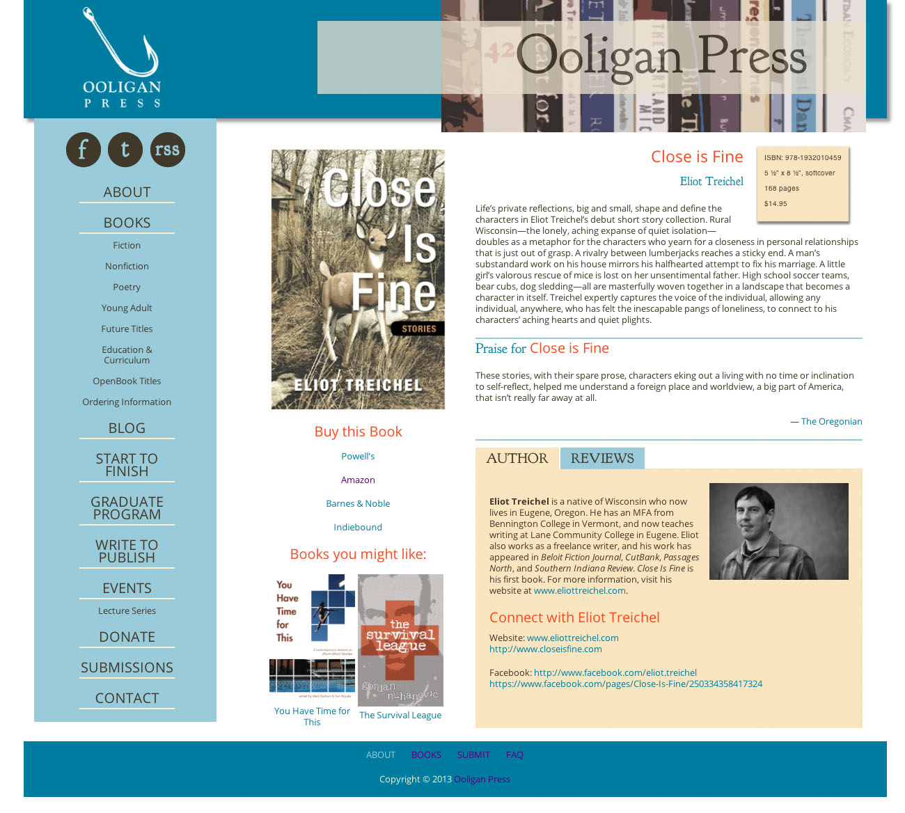
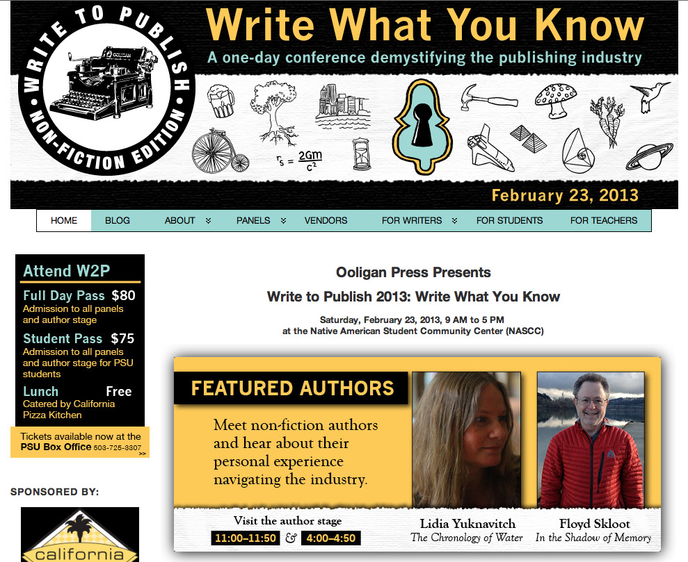
Before I was made manager of the Digital Content department, the website went through a redesign process. Though I wasn’t involved in the graphic design, I used html5 and css3 to transpose the design into several of the new WordPress theme page templates, including the book page seen below.
A note in 2025: The website does look dated now. Drop shadows are no longer prominent, and neither are sidenavs due to significant increases in mobile traffic. But we built it using Foundation as its base, one of the first responsive design frameworks that was released only a few months prior. All the rest was made from scratch by a group of grad students who taught themselves html, css, php, and Wordpress while also earning a Master’s degree. I think that alone is pretty ambitious, and pretty cool.
Website Optimization
After I was made manager, my first goals were to tie up all the loose ends and bugs the design conversion had created and to add polish to the site. I drew a lot of inspiration from Steve Krug’s Don’t Make Me Think as I worked on increasing the site’s usability and fixing the home page. I rewrote php to clean up some content management issues, reorganized the website’s pages and content in the front and back end to make it easier for a person to find what they were looking for, and rewrote link and header text to make it more apparent to the user where they were on the site and where they were headed.
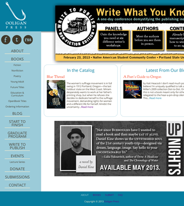
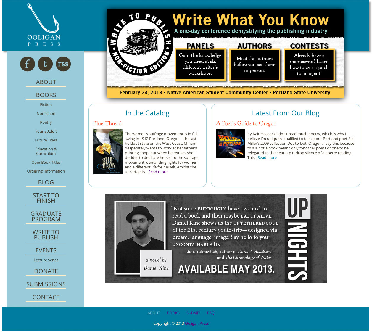
When I optimized the home page, I focused on making it clearer to visitors what the site was, what they could find on it, and where to go from the home page to start exploring. Rather than long, dated passages of text that would stay up for weeks, I suggested advertising the latest book release and blog post, as well as writing code to highlight a different backlist book in the Ooligan Press catalog every time the page was loaded. This told visitors what the site was—a press—and gave them more concrete places to explore after landing on the homepage.
Though the page's visual design would be much different today, the user experience principles I implemented worked and are timeless.
New homepage
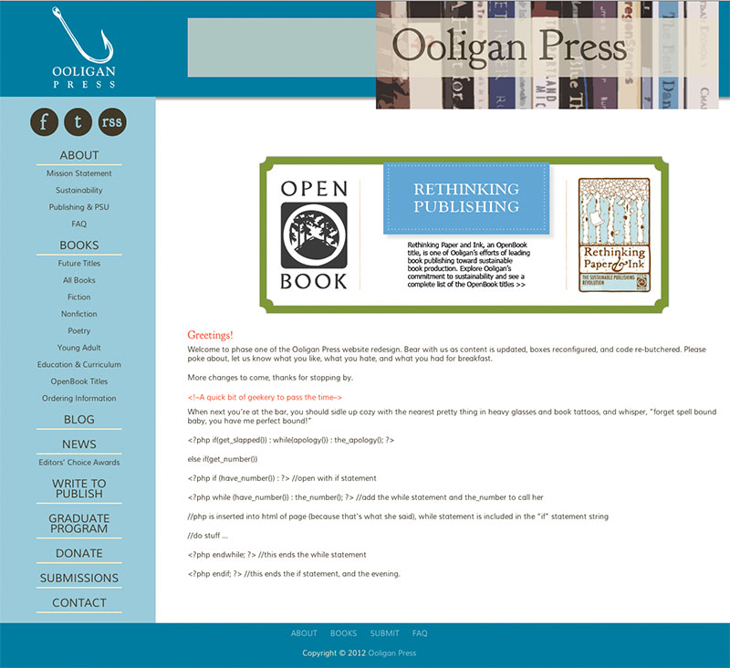
Old homepage
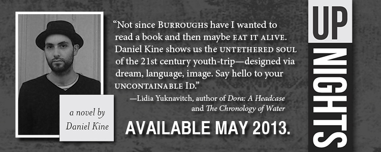
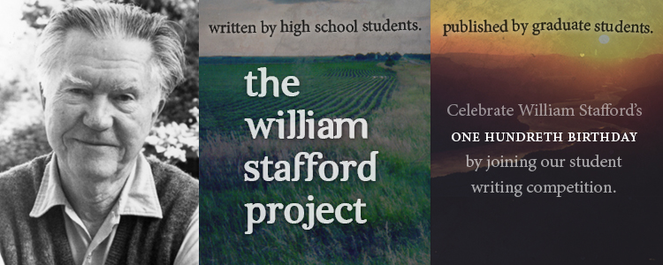
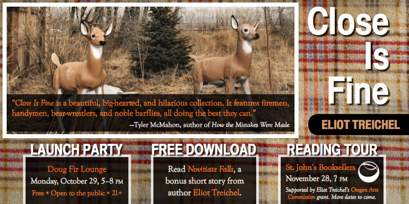
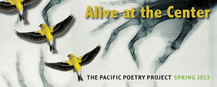
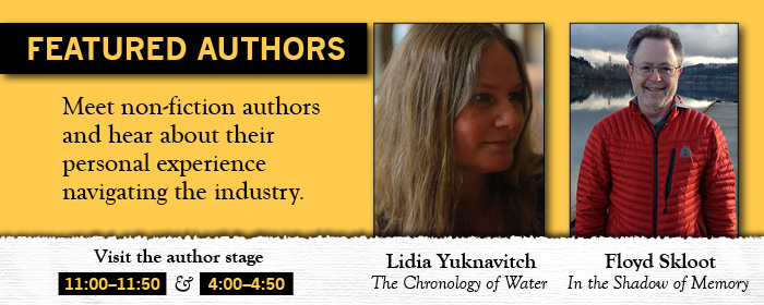
Below is a collection of promotional graphics and banners I designed for the Ooligan Press and Write to Publish websites:
Ooligan Press
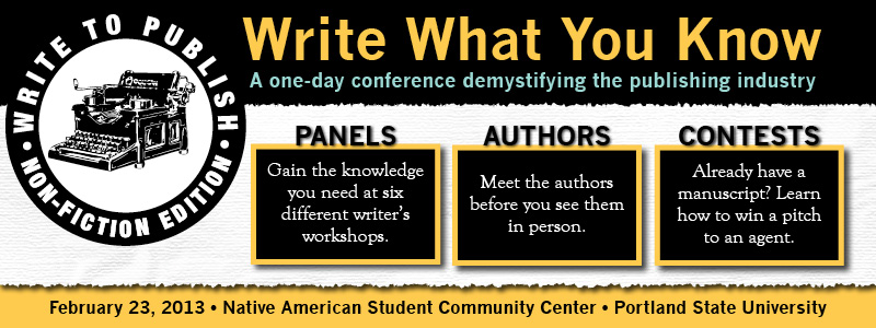
Write to Publish
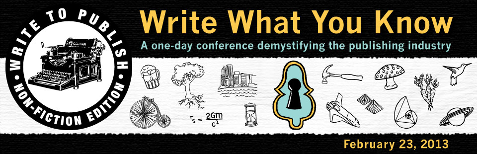

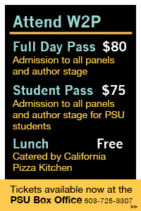
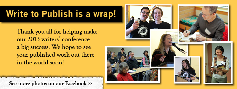
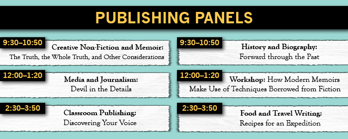
Special thanks to Lorna Nakell for the Write to Publish illustrations and Ooligan Press’s Design department for creating the great covers many of the promotions are based on.